//
Inner Pages
//
Contact
Tell us about your project, your goals, or your challenges, and let’s start shaping what’s next together.

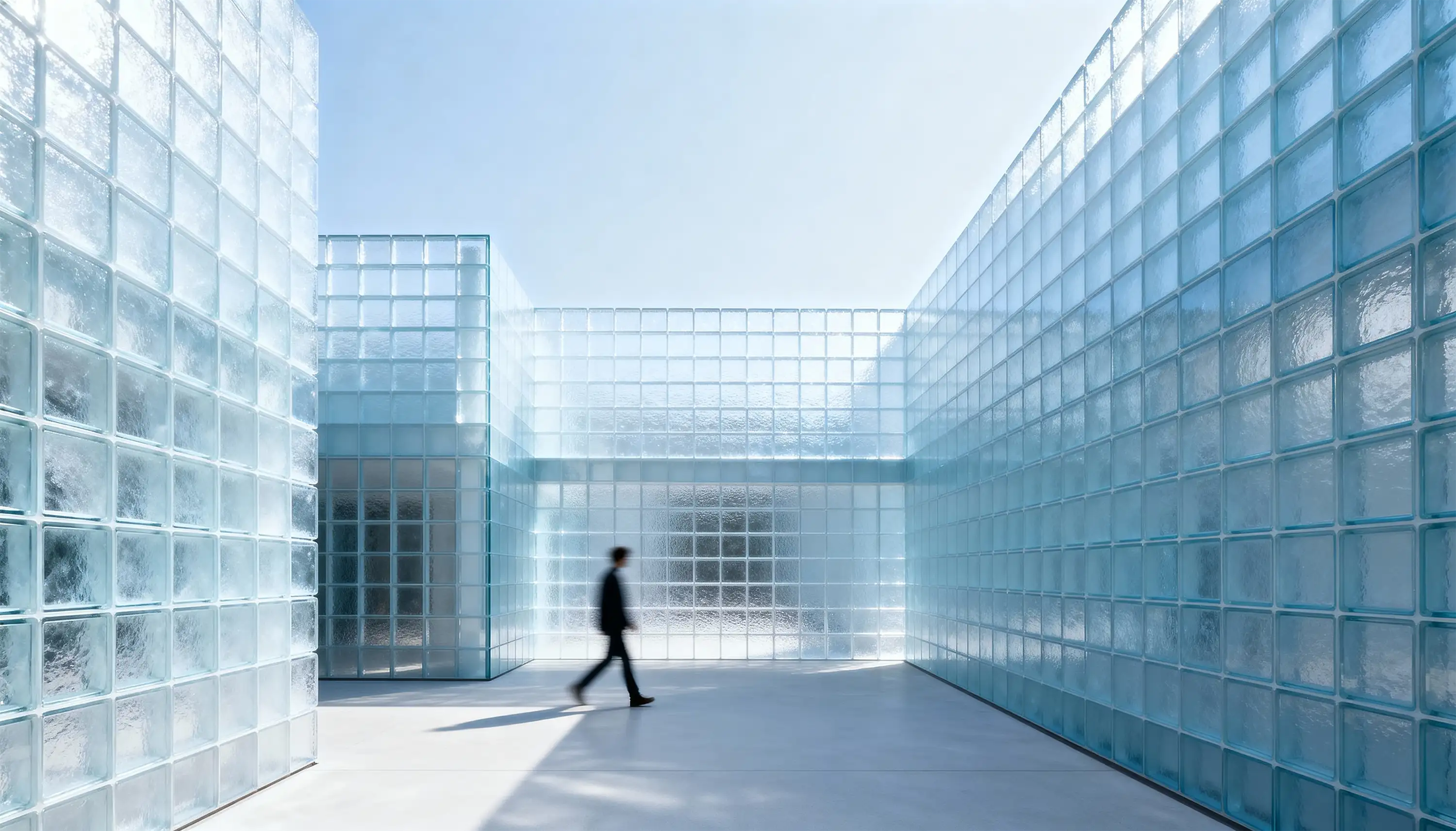
Echo Labs represents a rethinking of brand communication. The challenge: build a flexible identity system for a collective of thinkers and makers, where visual language adapts as the organization grows. We created a modular framework that unifies expression and function. Through typography, grid, and motion, the system balances individuality with collective clarity — structured, dynamic, and consistent.


Echo Labs required a structure that could speak for many — a brand built for collective creativity. We defined visual and verbal frameworks that allow flexibility without losing coherence.
Typography and grid became the silent infrastructure of expression. They ensure legibility, balance, and identity across diverse outputs.
We designed not just for what the brand says, but how it adapts. Echo Labs is built to evolve — clear, structured, and emotionally resonant.


We created a flexible grid that connects content, motion, and expression. The system adapts to multiple contexts while maintaining structural integrity.
Typography, spacing, and contrast rules ensure recognizability across platforms. Each layout echoes the brand’s voice — calm, confident, and precise.
Echo Labs can now evolve visually and functionally without fragmentation. The system turns complexity into clarity — identity that listens, adapts, and endures.